Why I blew up my remodeling and building materials web site with over 250,000 monthly views
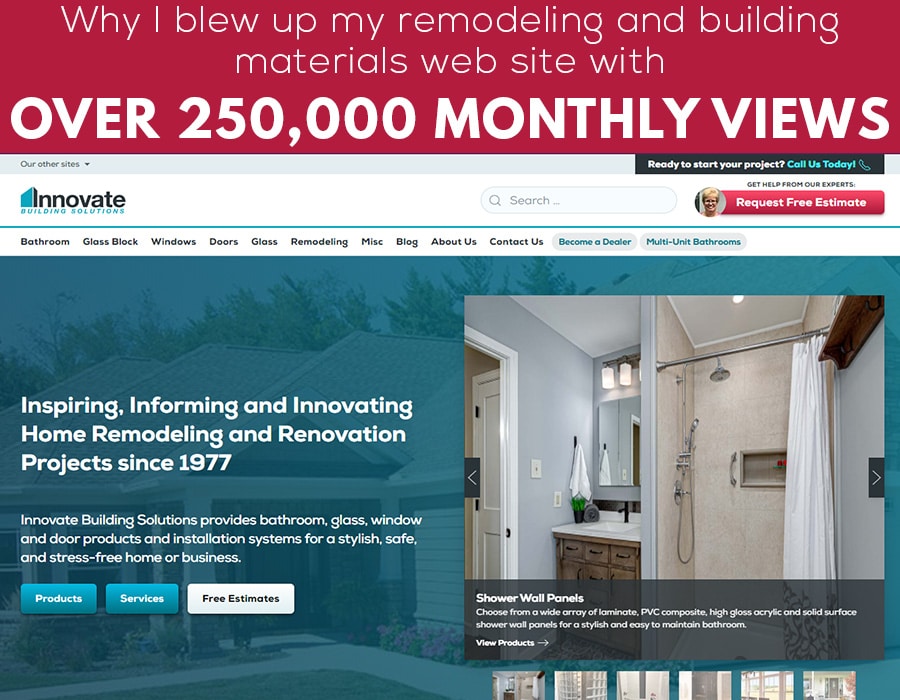
(Including 5 practical tips to take your site to the next level)
If your web site IS NOT putting your best foot forward, I get it.
You see most people would look at the results of my old web site (which had 250,000 monthly views, 1,850 monthly ‘conversions’ and an email list of over 38,000) and say we were rockin’ in. However, … I knew better.
I knew I was living with a 9-year car (‘er web site) with an engine which was misfiring and rust along the sides (for those of you who live in cold weather climates who know what rust on a car looks like).
Although most problems weren’t apparent to site visitors, I knew if my site was being graded by a trained digital marketing eye, they would give it a ‘elementary school grade’ of ‘NI’ (or Needs Improvement).
And I’ll bet if you lead a regional remodeling or nationwide building material wholesale business whose web site ISN’T God’s gift to marketers everywhere, you’ll relate to a few problems with our old site.
Problem #1 – Our local SEO (Search Engine Optimization) wasn’t ‘up to snuff’
Although my site had rockin’ results for nationwide product sales (a few of our nationwide products include laminate shower wall panels, shower pans and glass shower doors), when it came to generating local leads for competitive searches like ‘Columbus replacement windows contractor’ or ‘Cleveland bathtub to shower conversions’ – we were practically non-existent.
Our local pages needed a shot in the arm to grow our local bathroom (The Bath Doctor) and window and door divisions (Cleveland Window and Door and Clear Choice Window and Door in Columbus)
Problem #2 – Content was disorganized
Although the strength of our site (due to 4 blogs and a slew of product pages) is it’s loaded with ‘content’ (‘er in layman’s terms there’s a lot of stuff to read), this content had also grown like weeds in the garden. There was A LOT OF IT, but it wasn’t organized. It wasn’t simple to find the best content for the product or service someone was interested in.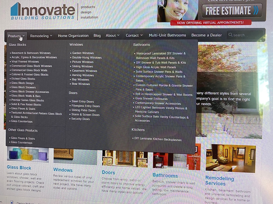
Problem #3 – Our site had ugly old pictures of products and services we haven’t offered in years
You know your web site ‘needs improvement’ if you look at old pictures with products you can’t get and/or services you’ve dumped a long time ago. We had outdated products AND services we no longer sold or installed. Our web site images needed a ‘clean up on aisle 3!’
Problem #4 – It wasn’t obvious why someone should buy from us
Although our site was being found in search (we had 200,000 monthly views on our blog and 50,000 views to our web site) – you would have been hard-pressed to know we’ve worked with over 190,000 customers since 1977 or have a 4.9 out of 5.0 Google rating or are selling products and systems to do an entire bathroom (not just improve the walls, or the shower pan or the glass shower doors only).
Bottom line – it was hard to figure out the advantages of buying from us on our old site.
Problem #5 – Our web site didn’t connect you to the people who will guide you along the way
When it comes to web sites most companies don’t celebrate (and connect customers to) the people who will help them through their project. Most sites are simply a listing of product and service pages with ‘stock photos’ of ‘operators standing by’ who are ready to take your call NOW for a ‘Free Estimate.’ (Check out the ‘generic woman with a headset image on our old site below – as the #1 culprit of a generic site).
These sites are not inviting. They don’t show the capabilities, background (and personalities) of the people who will help your prospect with their project.
If ‘our people’ are really ‘our difference,’ why is it in most sites you never see these ‘people who make the difference?’ And you don’t know how to contact them directly either.
Bottom line: Your web site should connect your prospects with your people.
And while it’s easy to poke holes in ANYBODY’S web site (including my own site)– the key is to make a site which is informative, inspirational (you’ve gotta do something to get prospects to want to connect with you) – and drives bottom-line results for your business.
However, the 10 million dollar question is (and hopefully your redesigned web site won’t cost this much), how do you create this type of site?
Well – I’m going to give you 5 sure-fire ideas we’ve used (and I’ll bet would be helpful to you) to ramp up your web site, create better results and eliminate the 5 problems listed above. Read on to improve your remodeling and building materials digital marketing results – and leapfrog your competitors tired old sites.
Let’s go.
Idea #1 – Start first with the ‘ABCs’ of a successful web site– Always Be Converting
A business web site is all about creating leads. I’m sure you’re saying right now, “Duh, tell me something I don’t know.”
And while this is the ‘Captain Obvious’ goal for business web sites, I’ll bet most of your sites ARE NOT designed to maximize leads. And while our old site did a good job converting leads (and we averaged 1,850 leads – also known as conversions – per month), I knew a better site design would notch things up even higher.![]()
And, if you’re looking for more leads from your site (like I am for mine), here’s 5 tips to get you the improved results you want:
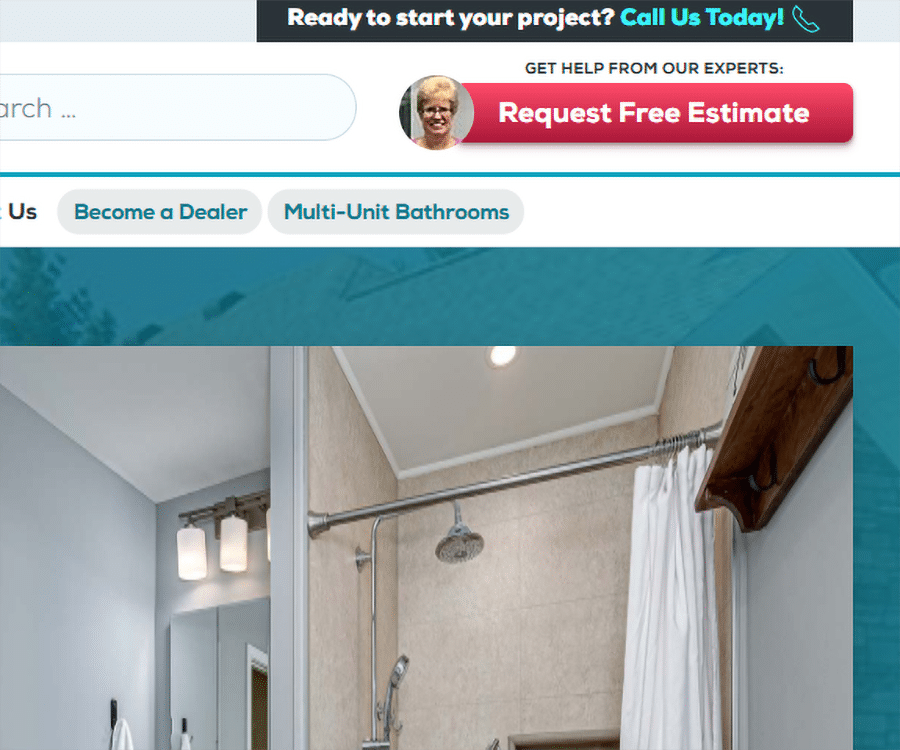
- Tip 1 – Put your phone numbers and Free Estimate button in the upper right-hand corner – Studies have shown the upper right-hand corner is the best location for the main goal(s) of your site. Those ‘goals’ are often phone number(s) to call or a Free Design Consultation form to fill out. And it’s amazing to see how many web sites make you go crazy trying to find a phone number or a free estimate button.
- Tip 2 – Include multiple Calls to Action (CTA), some which DO NOT ask for a Free Design Consultation Now – This is the biggest mistake people make is they forget the VAST MAJORITY of people visiting your site ARE NOT ready to buy now (or see a company rep for a free estimate). Most are researching a project they want to do ‘down the road.’ So, if the only CTA you have is ‘Call for a Free Estimate,’ you’ll find the site visitor ends up being another ‘bounce rate’ statistic (i.e. they pop in, then pop out of your site). And if you used Pay Per Click or Facebook advertising to get them to the site in the first place, that’s your good money going down the drain if they’re not ready to do an in-person or virtual appointment with you right now!
I’m here to tell you this is a baaaaaad strategy. So, here’s what you need to do instead.
Add different CTAs (Calls To Action) on your pages (and blog posts – if you do them). Offer free informational downloads or free samples in exchange for their email (like you’ll see in our Cleveland bathroom remodeling page below).
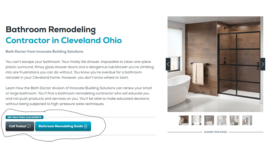
This single idea has helped our company grow an email list which is now north of 38,000 subscribers. These people are growing and learning with us. This strategy helps us stay top of their mind (no matter how long it is until they’re ready to talk to a Designer, Project Manager or Sales Rep and plunk down money to do the job).
- Tip 3 – Make sure your CTA’s ‘follow’ your visitors as they scroll down site pages – This ‘fancy’ web designer trick is to have your CTA’s scroll along with your visitors as they move down the page. This keeps your ‘goals’ front and center’ as the visitors move down the page. Your lead generation buttons don’t get lost. You’ll make it easy for visitors to take action.
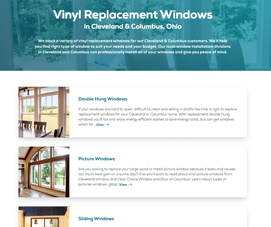
- Tip 4 – Localize to keep your regional sales and installation teams busy – I’ll admit my old web site did a terrible job bringing us local traffic. The pages weren’t written to describe our local service. Our URL and page titles weren’t localized to lead generate in our hometowns. This mistake was corrected by creating separate (localized) service pages for products like bathroom remodeling in Cleveland and vinyl replacement windows in Columbus Ohio.
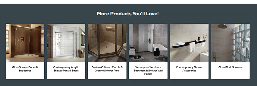
- Tip 5 – Grow the ‘depth’ of your leads by showing complimentary products or services – This is an idea copied right out of the Amazon playbook. You see although a visitor may visit your site for windows, they may not know you can also help them with doors or siding or bathroom remodeling. This is why you can ‘leverage’ the depth of your leads by showing other products or services a visitor might be interested in (like you’ll see below).
Idea #2 – Be an inspiration – it’s all about the pretty pictures (or cool videos)
People don’t buy remodeling jobs or building materials!
WTH (what the heck) you may be saying.
No – people buy the vision of a more stylish bathroom or kitchen (or other home improvement project), which ISN’T a pain to maintain. They buy the benefits they’ll get (and the problems they’ll solve) with your projects or building products.
And the best way to show this vision is through pretty (and up to date) pictures of jobs and videos. Let your prospect visualize these images as their new and exciting space.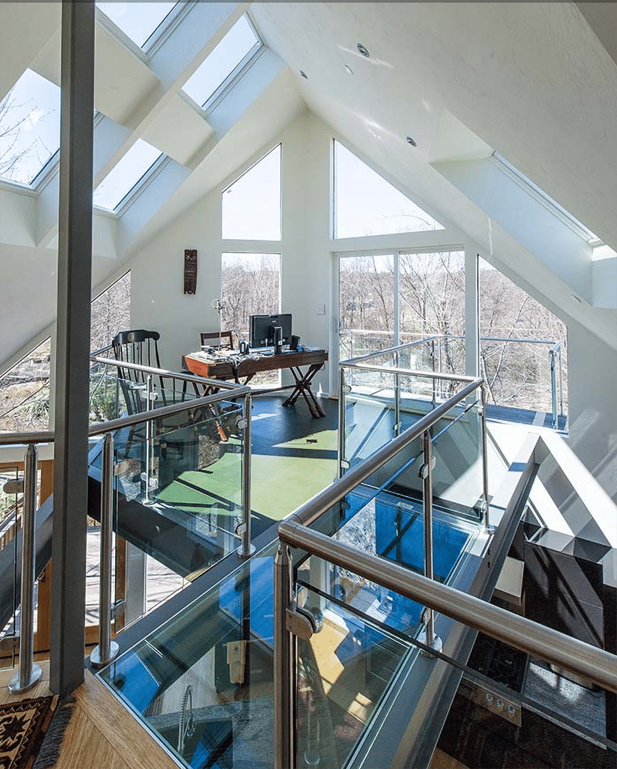
Get rid of outdated photos. Show what’s possible with before and after shots.
If possible, use professionally photographed images of your own jobs. If not, lean on material suppliers for the nicest images you can muster.
And lastly – for extra (Google Search results) credit, add ‘alt tags’ with a geographical description of where the job was done (note an ‘alt tag’ is a geeky term for coded text which describes the image). This will help your pictures be found in local search.
Idea #3 – Think chunky (and no, I’m not referring to Campbell’s soup) when organizing your site
Over time sites can turn into a jumbled mess of information and a seemingly random series of drop-down links. This makes a site hard to navigate. And my old site certainly was jumbled up as our business grew with more products and services.
In any site an intuitive (and organized) navigation structure is a must. You need to bring together common products and information which is specific to a person’s area of interest.
That’s why in our new site (which has over 60 web pages) organizing common products into ‘chunks’ of like-minded pages was essential. For example, we put our 4 lines of shower wall panels together. We organized our shower base offerings into one group. We sorted our local Cleveland bathroom remodeling services into one section.
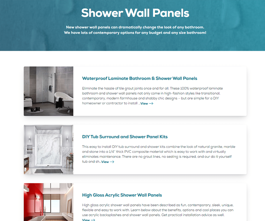
We also identified the top articles for each product and service page and created a section for this information on each web page. Our goal was to make it easy for site visitors to get educated WITHOUT needing to ‘hunt and peck’ around our site.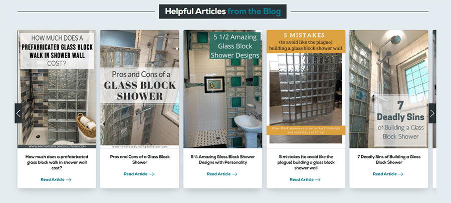
Ask people who visit your site for the first time how easy it was to navigate. Don’t fool yourself into thinking yours is better organized than it is (or it could go down the slippery slope my old site did – and become cluttered and confusing).
Idea #4 – Don’t create a generic site which doesn’t communicate a strong reason to connect with your business
You can ‘smell’ a generic web site from miles away.
Sure, it may have a bunch of products and services. And maybe it has one of those stock photos of a Customer Service Rep on a headset waiting to take your calls…. right now. There may be a picture of your team huddled around your building or in front of your trucks saying, “We have the best team. We have the best service. We have the best quality.” Your prospects think ……![]()
Blah, blah, blah. Who cares?
Many remodeling and building material web sites are boring and self-serving. And as a marketer or owner of this type of business you need to realize what the prospect knows all too well…. IT’S NOT ABOUT US! IT IS about HOW we uniquely help our prospect with their project.
However, we still need to motivate people to connect with our team. We still need to get leads and grow the business. What compelling reasons can you give to get people to connect with your products and services (even if they aren’t ready to buy right this minute)? Here’s 3 reasons to consider:
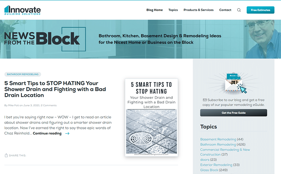
- Reason #1 – Be informative – People come to your site for one HUGE reason. They want solutions to their problems (whether they’re remodeling their bathroom or kitchen, or looking for a contractor to supply and install double hung windows). They want answers to their questions. They’re in ‘research mode’ BEFORE they’re in ‘buying mode.’ So, to win more people over become the ‘Encyclopedia Britannica (OK, now I’m dating myself) with answers to their questions. Create blog posts and videos with straightforward answers to their questions. Blow up your ‘fancy-schmancy’ technical jargon and communicate in plain English.
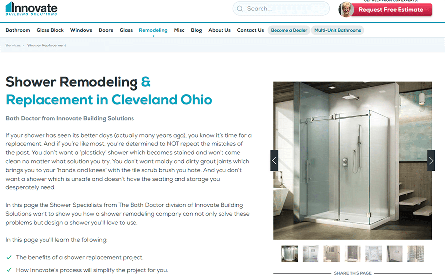
- Reason #2 – Be inspirational – Go back and read idea #2 above. Let your pictures and videos do their job. Get people excited about the vision of a better bathroom or kitchen or any home improvement project which is less of a pain to maintain.
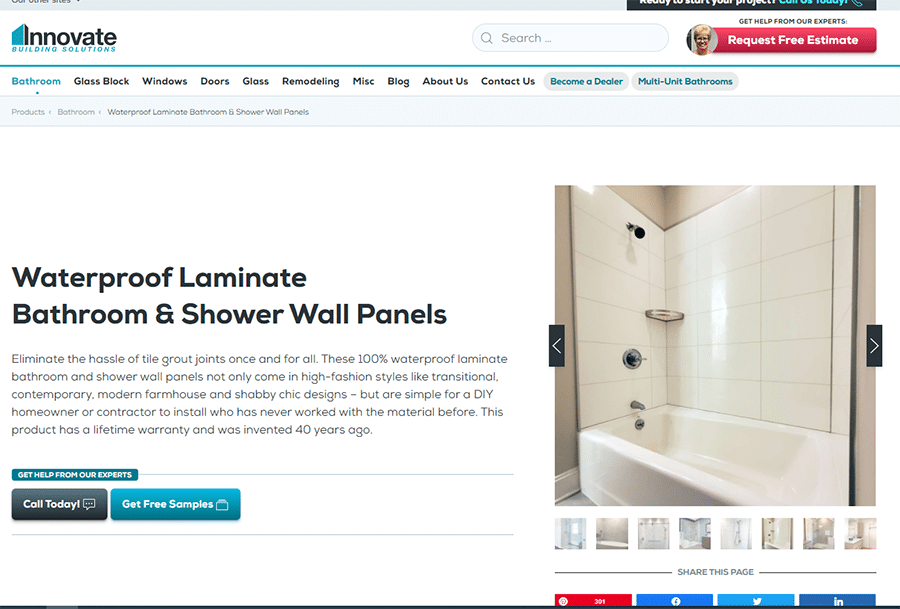
- Reason #3 –Show you’re an innovator– Identify what makes your installation process or products different. Highlight your uniqueness. Give site visitors reasons they NEED TO CALL YOU (besides your crazy good looks).
Idea #5 – Don’t forget to highlight your team (and how they help customers)
Quite frankly, most companies pay ‘lip service’ when they say, ‘our people are our biggest asset’ (especially if your first introduction to the company is their web site). You see their ‘VIP team’ is as invisible on their web site as Casper the Friendly Ghost (OK – that’s another reference which will date me).
However, your business doesn’t make much (if any) money without an effective team. Your team makes your projects inspirational and functional for your clients. Your team makes the ‘magic’ which promotes referrals and repeat business…. or not.
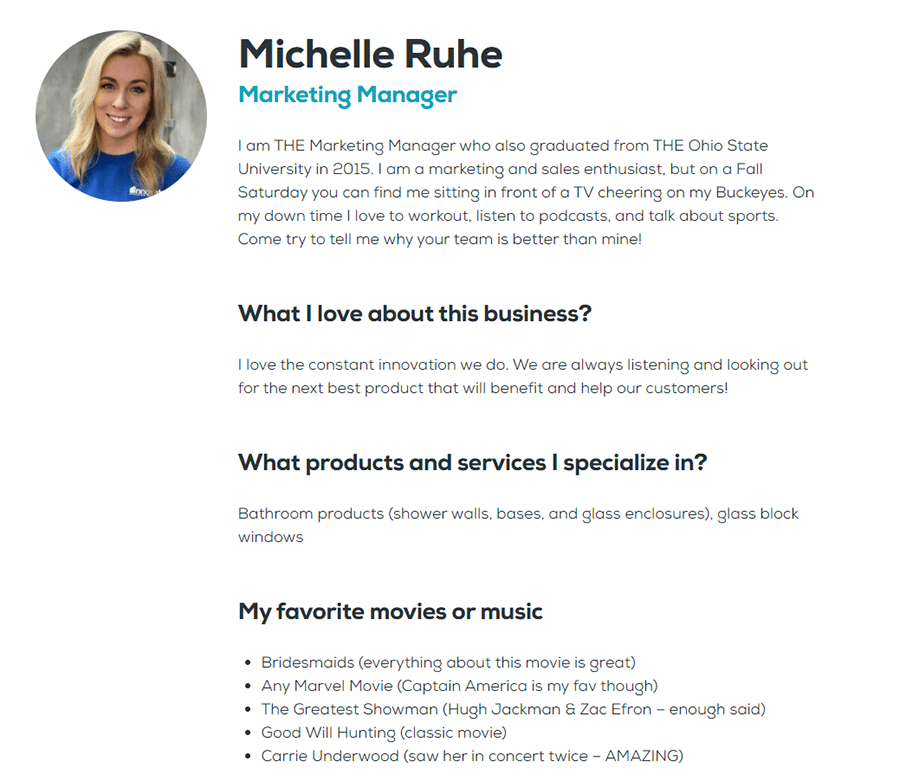
The question becomes how can you highlight your people on your site? How can you do it in a way which shows HOW and WHERE they help prospects and customers with projects? One way to do this is with a ‘Meet the Team’ section. This section does the following:
- It identifies your teams’ unique talents and skills in the business.
- It provides a way to connect with them (via email or phone numbers). Your team isn’t hiding behind ‘abbreviated names’ (‘er Mary T. or Bob S.) with no way to call them.
- It gives prospects a peek into their personality. It creates the personal connections which makes your company and your people relatable.
So, how can you use these web site ideas to make your business more profitable?
I hope you’ve read these ideas and are at least agreeing they’ll improve your site. However, if you’re like most people it’s one thing to nod your head in agreement, it’s quite another thing to put in the work and/or hire the right people (or company) to make these ideas a reality to improve your results.
And I’ll tell you this secret – while I’ve lived through making these changes in my newly relaunched web site – Innovate Building Solutions – I did not do it alone. I’ll give you referrals to 2 excellent resources to transform your site, like they did ours. And no, I’m not a paid endorser for either of these companies (although if they do want to give me an all-expenses paid trip to Hawaii I wouldn’t turn it down)!
- For web design– Call David Gardner from Kinopicz American at 614-754-1698.
- For digital marketing consulting – Call John Paglio from Take Flyte Media at 207-871-7921.
And lastly if you’re wondering how I can help you – besides sharing my journey of our relaunched web site here’s 3 ways:
- #1 – Look at becoming a bathroom products dealer to save time, money and add uniqueness to your jobs – You see I lead a business which wholesales grout free wall panels, shower pans and glass shower doors to a growing dealer network of bathroom remodelers who are improving their businesses with our products. Call 888-467-7488 and ask for Mike if you’re looking for bathroom products to grow your business.
- Idea #2 – Subscribe to my blog – Innovate Builders Blog with tips to run a better remodeling business.
- Idea #3 – Connect (and read) my content on LinkedIn https://www.linkedin.com/in/mikefoti/
Thanks for reading,
Mike
Tags: bath remodeling web site, bathroom remodeling web site, better pictures on web sites, building materials web site, calls to action remodeling site, CTA on remodeling site, local SEO for building materials, local SEO remodeling site, meet the team on remodeling web site, organizing content on a web site, remodeling web site, remodeling web site design, remodeling web site organization, results remodeling web site, web site conversion strategies, web site organization, web site results